
$ gnpm install rc-tooltip
rc-tooltip
React Tooltip


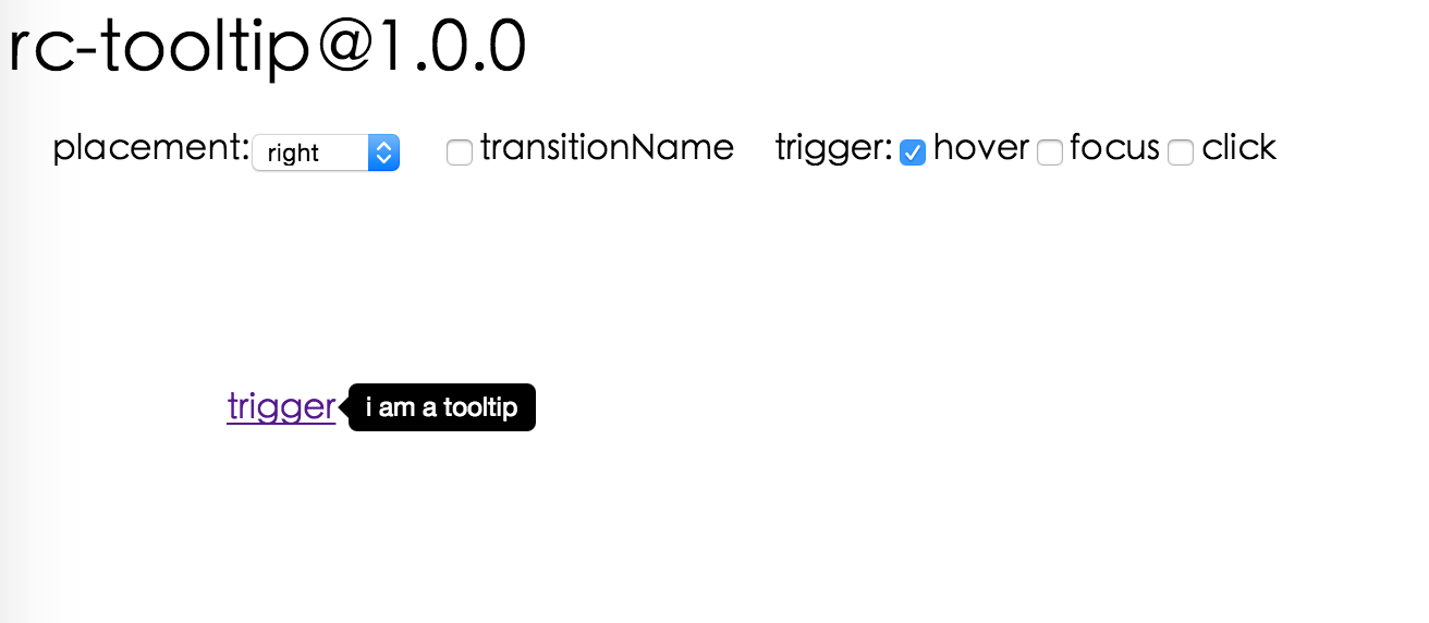
Screenshot
Browsers support
 IE / Edge IE / Edge |
 Firefox Firefox |
 Chrome Chrome |
 Safari Safari |
 Opera Opera |
|---|---|---|---|---|
| IE 8 + ✔ | Firefox 31.0+ ✔ | Chrome 31.0+ ✔ | Safari 7.0+ ✔ | Opera 30.0+ ✔ |
Install

Usage
var Tooltip = require('rc-tooltip');
var React = require('react');
var ReactDOM = require('react-dom');

// By default, the tooltip has no style.
// Consider importing the stylesheet it comes with:
// 'rc-tooltip/assets/bootstrap_white.css'

ReactDOM.render(
  <Tooltip placement="left" trigger={['click']} overlay={<span>tooltip</span>}>
    <a href="#">hover</a>
  </Tooltip>,
  container
);
Examples
npm start and then go to
http://localhost:8007/examples
Online examples: https://react-component.github.io/tooltip/examples/
API
Props
| name | type | default | description |
|---|---|---|---|
| overlayClassName | string | additional className added to popup overlay | |
| trigger | string | string[] | ['hover'] | which actions cause tooltip shown. enum of 'hover','click','focus' |
| mouseEnterDelay | number | 0 | delay time to show when mouse enter.unit: s. |
| mouseLeaveDelay | number | 0.1 | delay time to hide when mouse leave.unit: s. |
| overlayStyle | Object | additional style of overlay node | |
| prefixCls | String | rc-tooltip | prefix class name |
| transitionName | String|Object | same as https://github.com/react-component/animate | |
| onVisibleChange | Function | call when visible is changed | |
| afterVisibleChange | Function | call after visible is changed | |
| visible | boolean | whether tooltip is visible | |
| defaultVisible | boolean | whether tooltip is visible initially | |
| placement | String | one of ['left','right','top','bottom', 'topLeft', 'topRight', 'bottomLeft', 'bottomRight', 'rightTop', 'rightBottom', 'leftTop', 'leftBottom'] | |
| align | Object: alignConfig of [dom-align](https://github.com/yiminghe/dom-align) | value will be merged into placement's config | |
| onPopupAlign | function(popupDomNode, align) | callback when popup node is aligned | |
| overlay | React.Element | () => React.Element | popup content | |
| overlayInnerStyle | Object | set overlay inner style | |
| showArrow | boolean | true | arrow visible |
| arrowContent | React.Node | null | arrow content |
| getTooltipContainer | function | Function returning html node which will act as tooltip container. By default the tooltip attaches to the body. If you want to change the container, simply return a new element. | |
| destroyTooltipOnHide | boolean | { keepParent: boolean } | false | whether destroy tooltip when tooltip is hidden.In general, destroyTooltipOnHide will only remove itself instead of parent container of it. Parent container will be removed include tooltip when keepParent is true |
| id | String | Id which gets attached to the tooltip content. Can be used with aria-describedby to achieve Screenreader-Support. |
Important Note
Tooltip requires a child node that accepts an onMouseEnter, onMouseLeave, onFocus, onClick event. This means the child node must be a built-in component like div or span, or a custom component that passes its props to its built-in component child.
Accessibility
For accessibility purpose you can use the id prop to link your tooltip with another element. For example attaching it to an input element:
<Tooltip
    ...
    id={this.props.name}>
    <input type="text"
           ...
           aria-describedby={this.props.name}/>
</Tooltip>
If you do it like this, a screenreader would read the content of your tooltip if you focus the input element.
NOTE: role="tooltip" is also added to expose the purpose of the tooltip element to a screenreader.
Development
npm install
npm start
Test Case
npm test
npm run chrome-test
Coverage
npm run coverage
License
rc-tooltip is released under the MIT license.
Current Tags
- 6.0.1 ... latest (3 years ago)
89 Versions
- 6.0.1 ... 3 years ago
- 6.0.0 ... 3 years ago
- 5.3.1 ... 3 years ago
- 5.3.0 ... 3 years ago
- 5.2.2 ... 4 years ago
- 5.2.1 ... 4 years ago
- 5.2.0 ... 4 years ago
- 5.1.1 ... 5 years ago
- 5.1.0 ... 5 years ago
- 5.0.2 ... 5 years ago
- 4.2.3 ... 6 years ago
- 5.0.1 ... 6 years ago
- 5.0.0 ... 6 years ago
- 4.2.2 ... 6 years ago
- 4.2.1 ... 6 years ago
- 4.2.0 ... 6 years ago
- 4.1.0 ... 6 years ago
- 4.0.3 ... 6 years ago
- 4.0.2 ... 6 years ago
- 4.0.1 ... 6 years ago
- 4.0.0 ... 6 years ago
- 4.0.0-alpha.3 ... 7 years ago
- 4.0.0-alpha.2 ... 7 years ago
- 4.0.0-alpha.1 ... 7 years ago
- 4.0.0-alpha.0 ... 7 years ago
- 3.7.3 ... 8 years ago
- 3.7.2 ... 8 years ago
- 3.7.1 ... 8 years ago
- 3.7.0 ... 9 years ago
- 3.6.0 ... 9 years ago
- 3.5.0 ... 9 years ago
- 3.4.9 ... 9 years ago
- 3.4.8 ... 9 years ago
- 3.4.7 ... 9 years ago
- 3.4.6 ... 9 years ago
- 3.4.5 ... 9 years ago
- 3.4.3 ... 9 years ago
- 3.4.2 ... 10 years ago
- 3.4.1 ... 10 years ago
- 3.4.0 ... 10 years ago
- 3.3.5 ... 10 years ago
- 3.3.4 ... 10 years ago
- 3.3.3 ... 10 years ago
- 3.3.2 ... 10 years ago
- 3.3.1 ... 10 years ago
- 3.3.0 ... 11 years ago
- 3.2.0 ... 11 years ago
- 3.1.1 ... 11 years ago
- 3.1.0 ... 11 years ago
- 3.0.4 ... 11 years ago
- 3.0.3 ... 11 years ago
- 3.0.2 ... 11 years ago
- 3.0.1 ... 11 years ago
- 3.0.0 ... 11 years ago
- 2.10.1 ... 11 years ago
- 2.10.0 ... 11 years ago
- 2.9.0 ... 11 years ago
- 2.8.0 ... 11 years ago
- 2.7.1 ... 11 years ago
- 2.7.0 ... 11 years ago
- 2.6.5 ... 11 years ago
- 2.6.4 ... 11 years ago
- 2.6.3 ... 11 years ago
- 2.6.2 ... 11 years ago
- 2.6.1 ... 11 years ago
- 2.6.0 ... 11 years ago
- 2.5.1 ... 11 years ago
- 2.5.0 ... 11 years ago
- 2.4.1 ... 11 years ago
- 2.4.0 ... 11 years ago
- 2.3.0 ... 11 years ago
- 2.2.4 ... 11 years ago
- 2.2.3 ... 11 years ago
- 2.2.2 ... 11 years ago
- 2.2.1 ... 11 years ago
- 2.2.0 ... 11 years ago
- 2.1.2 ... 11 years ago
- 2.1.1 ... 11 years ago
- 2.1.0 ... 11 years ago
- 2.0.4 ... 11 years ago
- 2.0.3 ... 11 years ago
- 2.0.2 ... 11 years ago
- 2.0.1 ... 11 years ago
- 2.0.0 ... 11 years ago
- 1.2.0 ... 11 years ago
- 1.1.2 ... 11 years ago
- 1.1.1 ... 11 years ago
- 1.1.0 ... 11 years ago
- 1.0.0 ... 11 years ago
 silentcloud
 benjycui
 yesmeck
 afc163
 yiminghe
 paranoidjk
 zombiej
 madccc
- @babel/runtime ^7.11.2
- @rc-component/trigger ^1.0.4
- classnames ^2.3.1
- @rc-component/father-plugin ^1.0.0
- @testing-library/react ^13.4.0
- @types/jest ^26.0.0
- @types/react ^18.0.26
- @types/react-dom ^18.0.10
- @types/warning ^3.0.0
- cross-env ^7.0.0
- dumi ^2.1.1
- eslint ^7.1.0
- father ^4.0.0
- gh-pages ^3.1.0
- less ^3.11.1
- np ^7.1.0
- rc-test ^7.0.9
- react ^18.2.0
- react-dom ^18.2.0
- typescript ^4.0.5